Dluhopisomat lets retail investors access corporate bonds, a category historically reserved for institutions. The product worked; the brand wasn’t keeping up. I led a redesign anchored in strategy: who the platform serves, how trust is communicated visually, and what "modern Czech investing" should look and feel like in 2026.
The brief covered both halves of the system: a brand foundation that could hold up in regulated financial context, and a homepage that translates the promise into a real conversion surface.
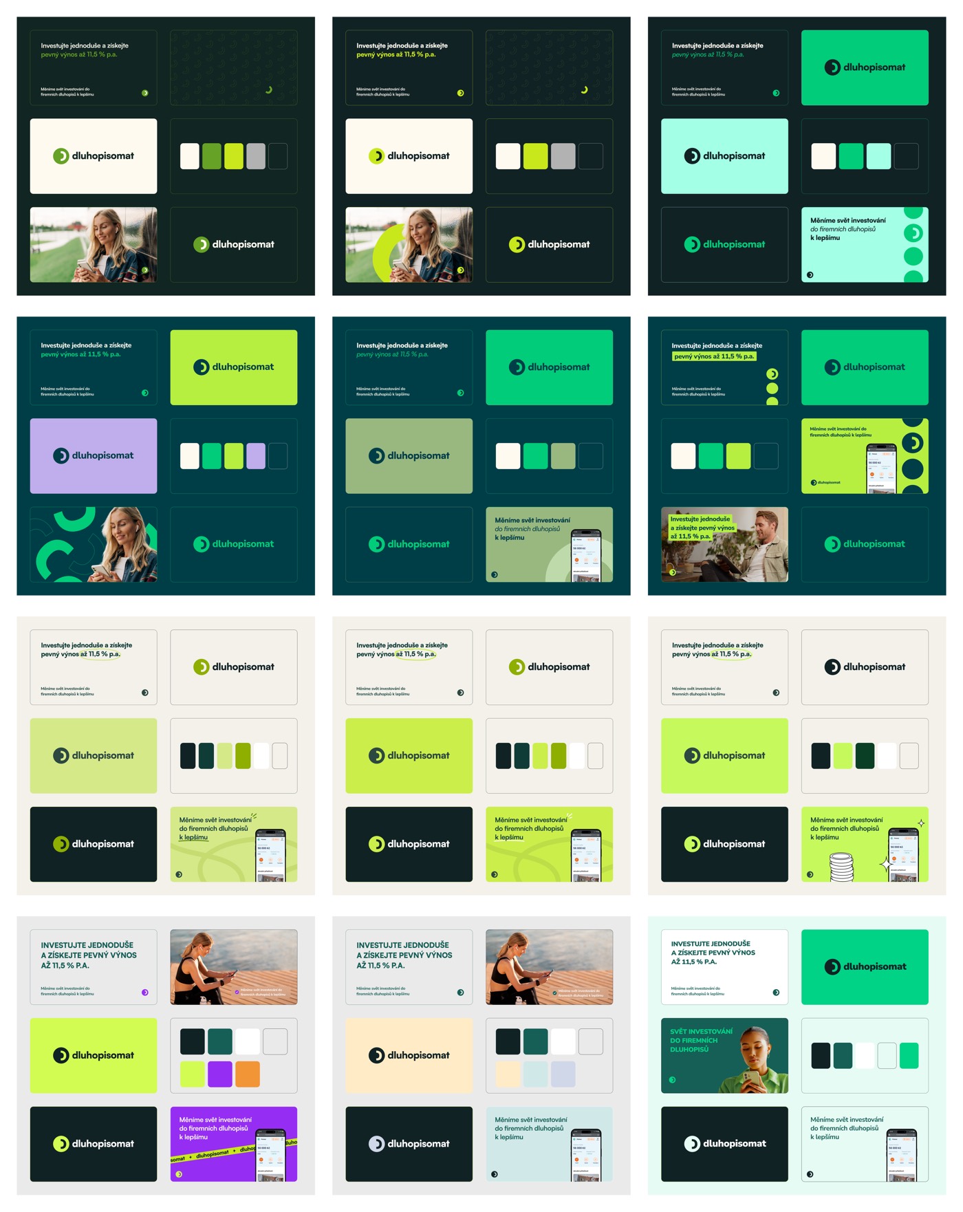
Twelve directions, three palette families.
To find the right voice, I explored across three palette families in parallel: dark + vibrant (institutional trust with a kick of growth), light + pastel (accessibility, friendly), and high-contrast neon (modern fintech). Each board tested type, photography, and layout against the same brand promise so we could compare like with like.
The early dark + vibrant directions felt premium but cold. The pastel options were warm but read more lifestyle than financial. The high-contrast neon felt punchy but undermined the credibility a regulated bond platform needs. The middle ground, dark teal with a confident green accent, landed: serious enough for the asset class, approachable enough for first-time bond investors.
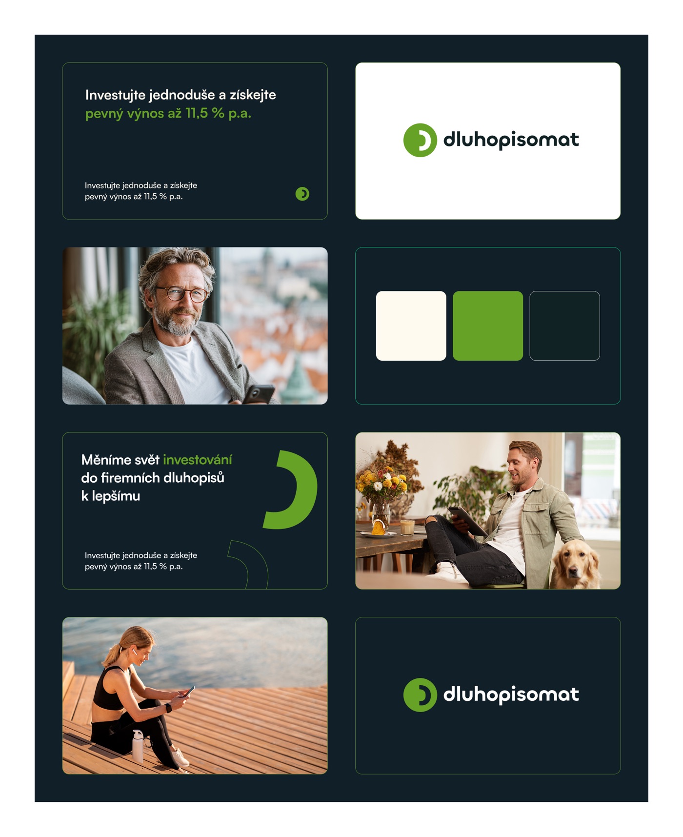
Trust as a system, not a tagline.
The final identity is anchored by deep teal and a single confident green. Photography is everyday Czech life, not stock-finance imagery, so the brand reads human before it reads institutional. Type is a clean sans for legibility; the wordmark doubles as a recognition symbol that scales from favicon to billboard.
Every element earns its place: the palette signals trust + growth, the type signals clarity, the imagery signals "this is for you." Together, the brand finally matches the product underneath it.
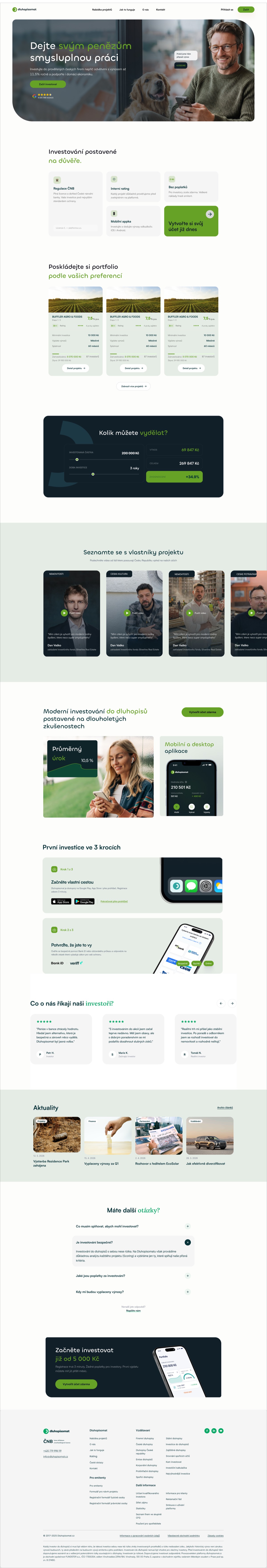
A homepage that answers the trust questions first.
The homepage opens with the headline promise, a fixed yield up to 11.5% p.a., and immediately answers the questions a first-time investor brings: Is this regulated? How are projects rated? Can I do this from my phone? The hero pairs the offer with three trust badges (ČNB regulation, internal rating, mobile app) before asking for anything.
From there: portfolio composition, return calculator, project-owner videos, app preview, a three-step onboarding flow, testimonials, news, and a FAQ block. Every section earns the next, building toward a single CTA that’s been derisked by everything above it.