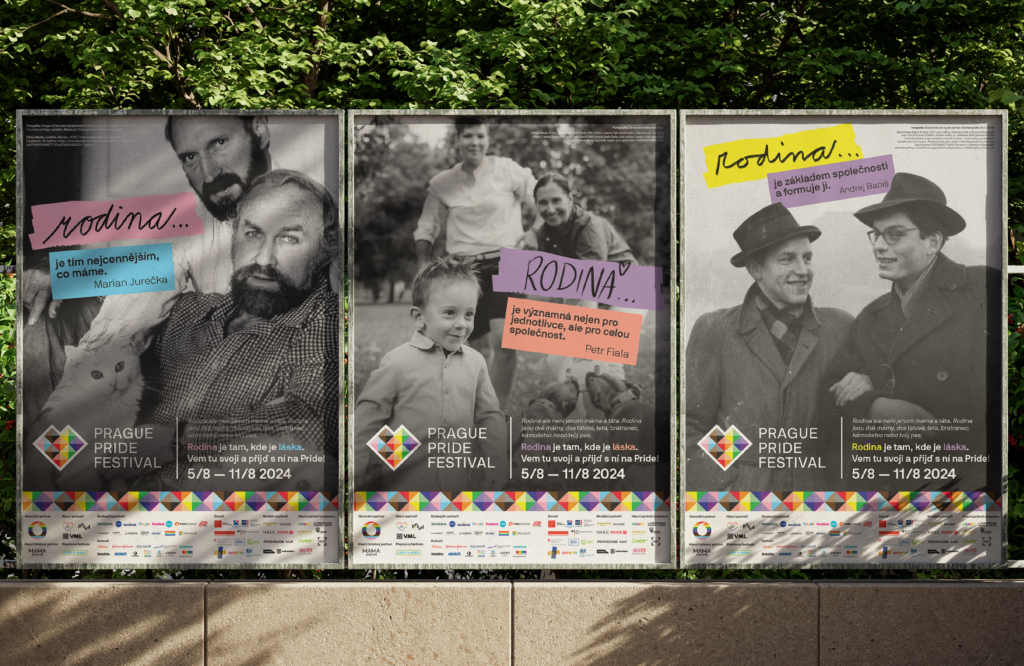
For the past 4 years, I’ve been the lead graphic designer and handled print production for the Prague Pride Festival. This year, I took on the visual communication for the campaign, shaping its creative direction and impact.
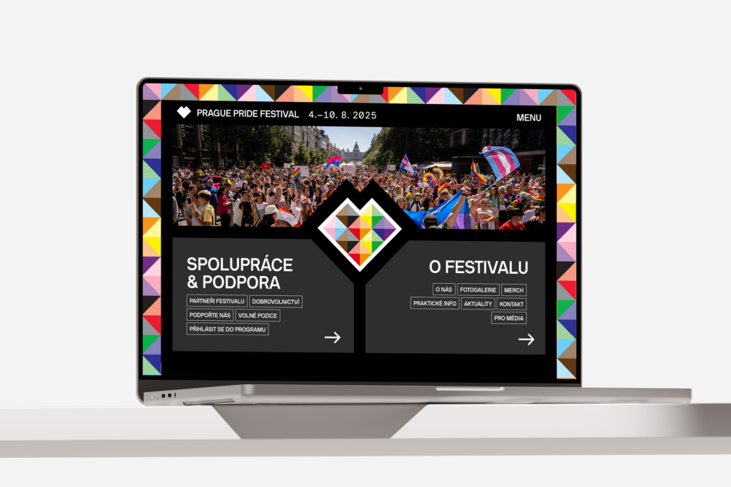
The project aimed to redesign the festival’s website to better serve its diverse target audiences.
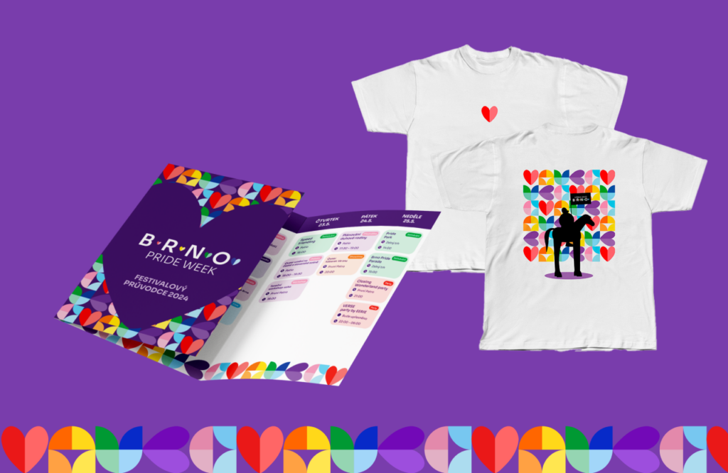
I created the visual identity for the festival, which included a complete design concept and its application across all promotional materials. I developed the communication strategy for the fundraising campaign and also designed the website for this purpose.
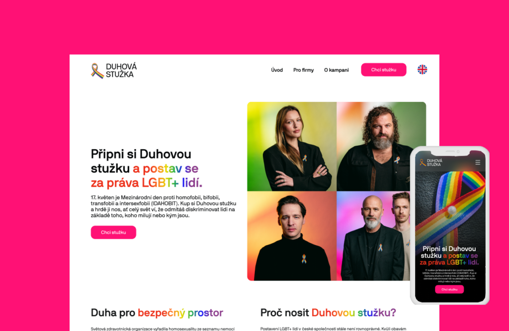
I designed the visual identity and website for a project that supports community activities. The sale of rainbow ribbons raises funds for the Prague Pride organization, which focuses on supporting the queer community.
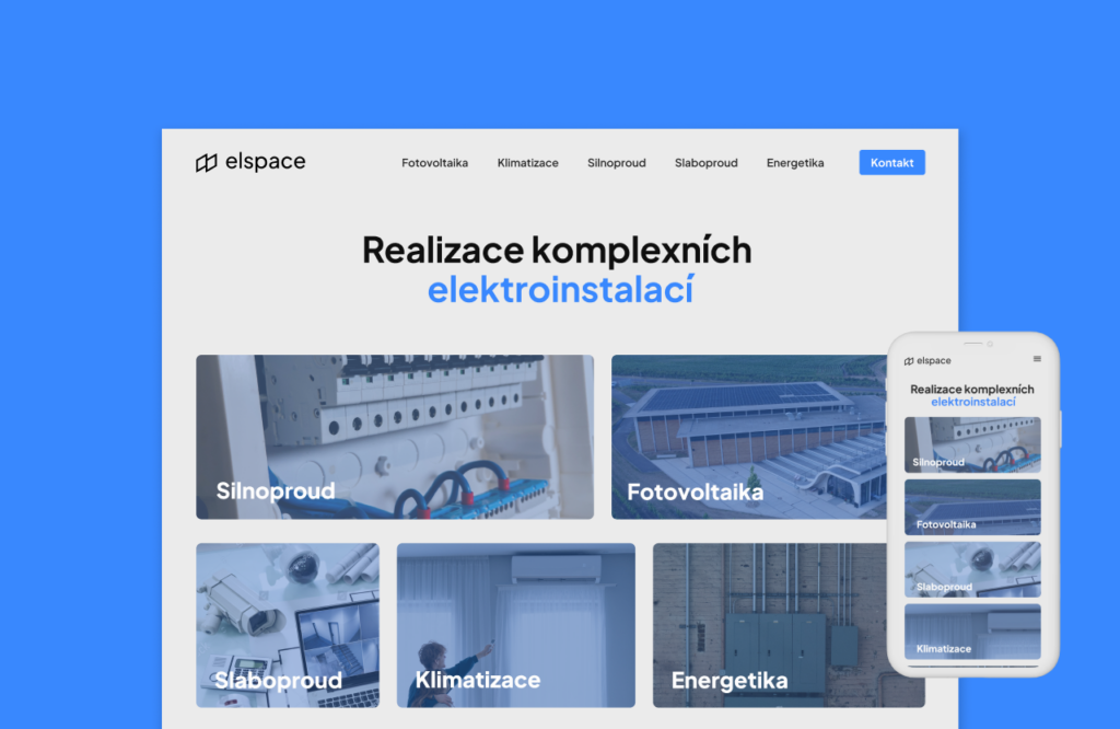
Elspace has been on the market for several years. With growing demand for their services, they decided to refresh their website. The original site was cluttered, making the services harder to understand for users. The goal of the new website was to simplify the content and make the services more accessible.
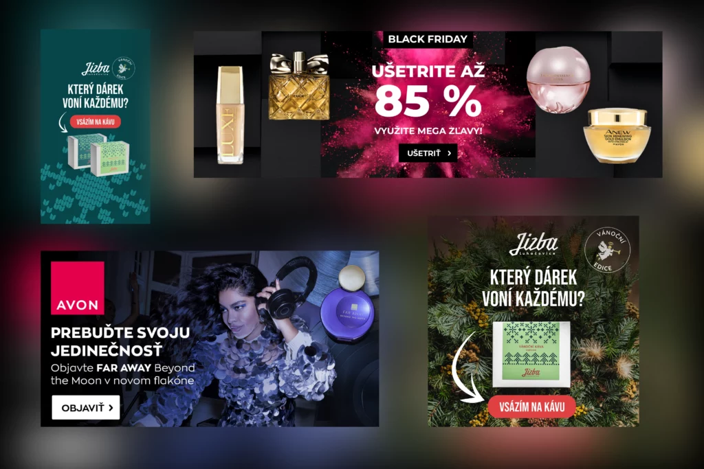
Banners might not always steal the spotlight, but they are an essential part of any online strategy. In a world filled with distractions, we specialize in creating banners that cut through the noise and leave a lasting impression.
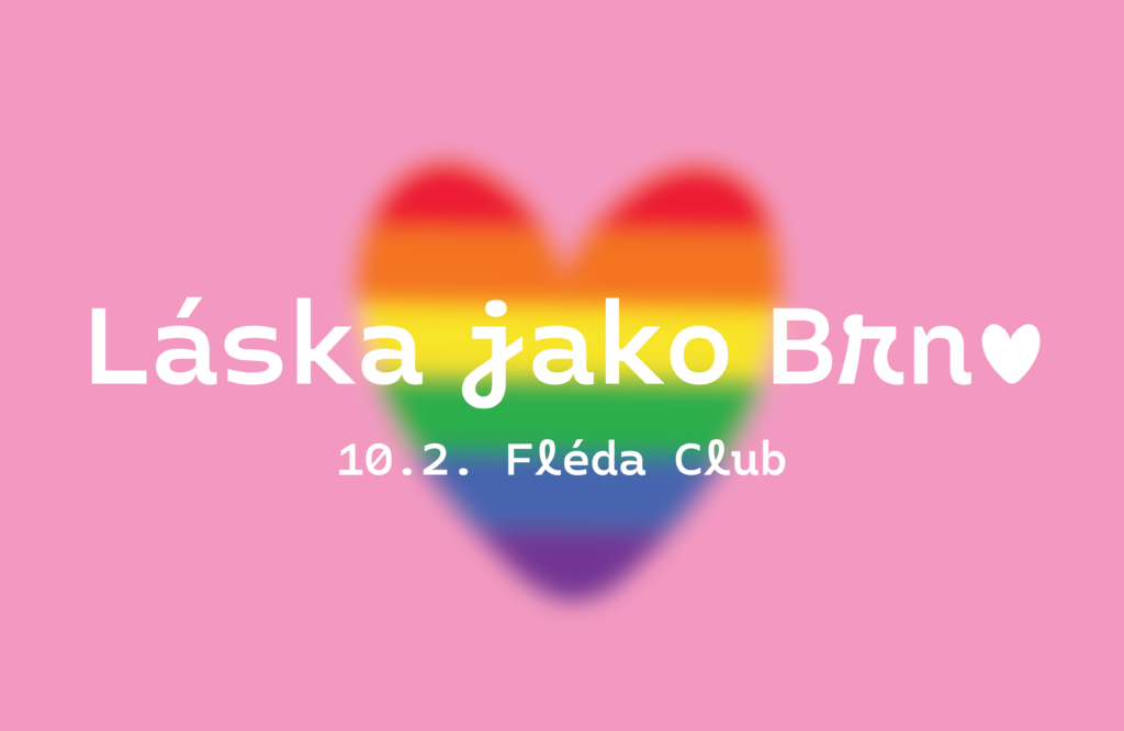
For the Pride Valentine’s Party 2024 in Brno, I developed a cohesive visual identity across both print and digital platforms. The event’s design focuses on inclusivity and love, conveyed through vibrant colors and playful typography.
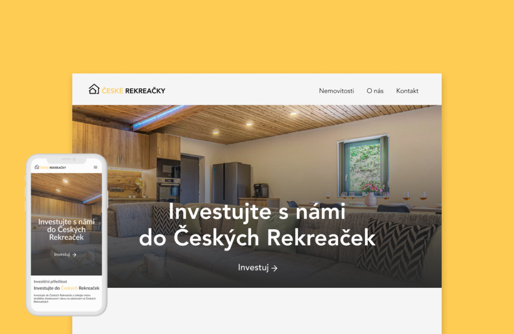
České rekreačky is a newly established company, and its innovative approach to real estate investing is paired with a modern visual style. The goal was to create a clear and user-friendly website, allowing users to easily navigate and start investing.
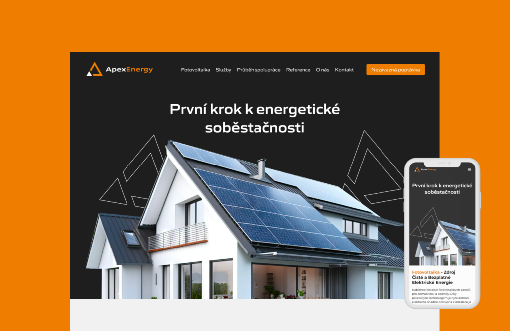
I created a website for a newly established company specializing in the installation of photovoltaic systems. I also designed the complete brand identity for the company, including the logo, corporate colors, and typography.
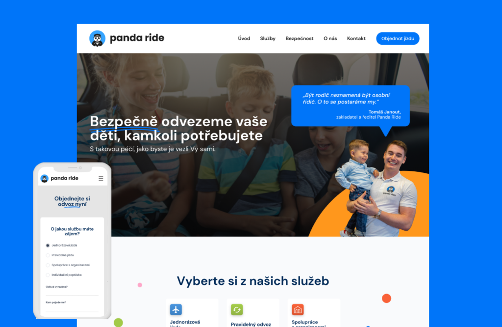
Redesign of a website for a company that transports children. The original site wasn’t responsive and felt cluttered. The client wanted a new, clean website with a playful touch, reflecting the nature of their industry.
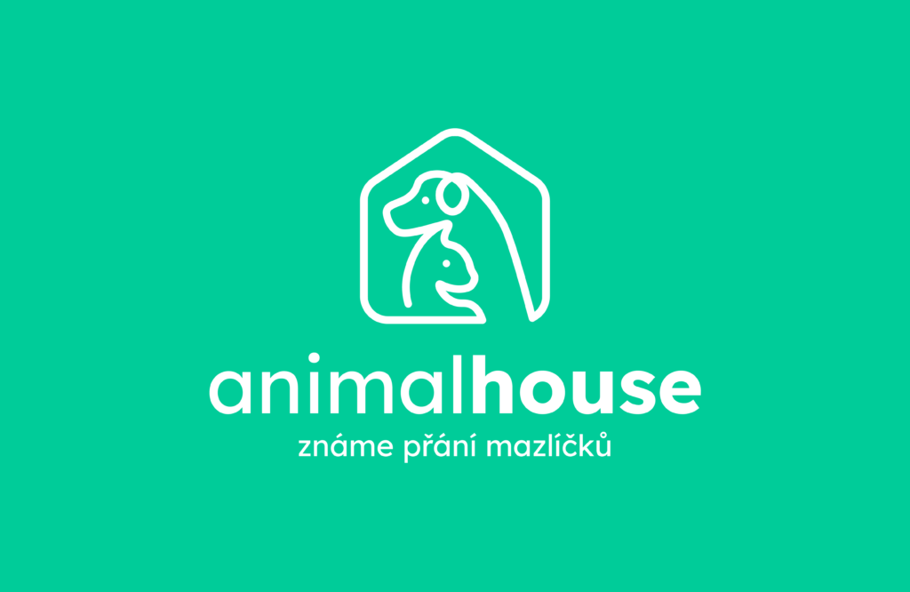
I created a complete new visual identity for Animalhouse, delivering a fresh and cohesive brand design that aligns with its unique personality and values.
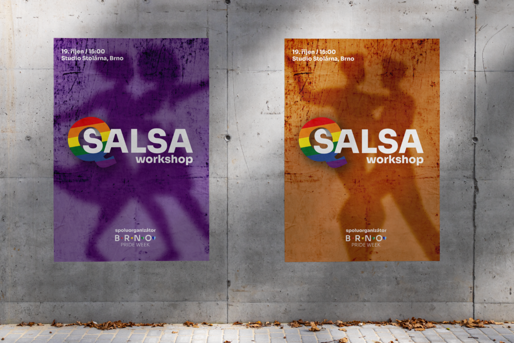
This project features a series of visuals created for a salsa dance workshop aimed at the queer community and their allies.
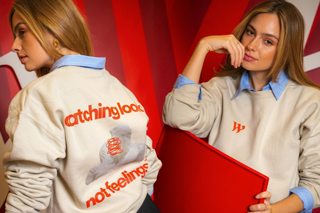
I created a merchandise collection for Westfield Chodov, focusing on bold and authentic designs aimed at Gen Z.